The fundamental puzzle of the UK economy post the
financial crisis
One of the many ironies of the
Brexit debate in the UK was the fact that over a period when the problem of
immigrants taking British jobs was the focus of public concern the number of
people at work in the UK had risen to previous unknown heights. In this note I
document how dramatic have been the changes of the last decade and how
different was that job growth compared with the recessions prior to that of
2002-08. I show that the British economy has been good at increasing earnings
or increasing the number of jobs, it has not proved good at doing both.
Employment
Just how different has been the
pattern of job growth in the UK since the financial crisis, of 2007 to 2008, as
compared with the previous recession in 1991 is shown in the Figure 1 below.
Figure 1 Employment in the UK: 1970
- 2020
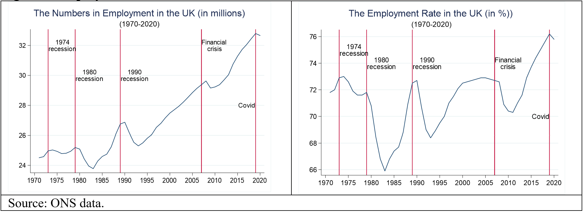
Not only was the decline in jobs following the financial crisis modest relative to the fall after the 1991 recession but the recovery was far more rapid and the numbers of people in work grew rapidly after 2011 until the advent of the pandemic in 2020. The decline in employment with the lockdowns in 2020 is very modest as the ONS counts furloughed workers as employed on the grounds that they still have jobs and are temporarily absent. That does means that for 2020 that the numbers classified as employed are not the same as the numbers working, a point to which I return below.
In fact, the left-hand chart
understates the magnitude of the achievement of the UK economy in creating
jobs. Employment will grow because the population of those of working age
increases. Indeed, over much of this period immigration increased. So, we want
to know how many jobs there were relative to the population of working age.
This is called the employment rate. It tells you what percentage of those in
the population who could work found jobs.
In the three decades from 1970 to
2000 the employment rate fluctuated between 73 and 66 per cent. It reached its
nadir of 66 per cent in the early 1980s after the first of the Thatcher
recessions in 1981. However, this recession simply continued a downwards trend
in the employment rate which can be dated from the mid-1970s. The second
Thatcher recession of 1991 saw a sharp fall in the employment rate reducing it
by some 4 percent points. The 1990s saw some recovery but by 2000 it was still
below the level of the mid-1970s. The proportion of those in work since the
1970 had simply fluctuated between 73 and 66 per cent, after 2010 it took off.
Contrast the pattern before 2000
with the pattern afterwards. Compared with earlier recessions from 1970 to 2000
the financial crisis had a very modest effect on the employment rate, a decline
of only 2 percentage points, while within two years of the crisis the
employment rate started to increase and rose continually for the next five
years to reach 76 per cent by 2019/2020, far exceeding the highest rates
achieved in the three decades from 1970 to 2000.
Hours worked
I noted above that for 2020
employment levels did not reflect hours worked. If we want to understand what determines
the labour supply to the economy we need to consider not simply the numbers
employed but how many hours they work. Indeed, it is hours worked that is the
relevant measure of how much labour is supplied to the economy. In Figure 2
below I show how average and total weekly hours have changed from 1970 to 2020.
We can now see the effects of the Covid pandemic on labour supply with the
collapse in total hours worked in the right-hand chart of the Figure. Between
its nadir in 1983 of 795.3 million hours it had reached 1 billion hours in
2019, the year before the pandemic decimated labour input into the economy. As
the left-hand chart shows from 1983 to the financial crisis of 2008 average
hours fell so over that period the number of jobs was rising faster than the
labour supply.
Figure 2 Labour supply: Average and
Total Hours Worked

What we need to explain
We can now clearly state what needs
to be explained. Why after the most severe recession in post war UK history in
2008 did labour supply grow in a way it had never done before?
Figure 3 GDP and Earnings

There were two other major
differences between the post Financial crisis and previous recessions which are
shown in the left-hand chart of Figure 3 above. The first was that the growth
rate of productivity, measured as GDP per hour worked, fell in a sustained way.
The behaviour of real wages was even more dramatic. For the five years after
the start of the financial crisis in 2007 the growth rate of real hourly
earnings was negative. As the charts show this fall was unprecedented. The
contrast with the first of the Thatcher recession is striking. In the early
1980s neither the growth of productivity nor real earnings were ever negative.
The cumulative effects of growth
rates are hard to see so in the right-hand chart of Figure 3 I show the
implication of these growth rates for the level of productivity and for real
hourly earnings. The results of these very different patterns of growth rates
implied that the level of productivity grew very little while real hourly
earnings fell such that by 2019, on the eve of the Covid pandemic, they were
back to their level of 2005, two years before the financial crisis.
So, what we need to explain is very
puzzling? Falls in labour productivity would normally lead to a fall in the
demand for labour and a fall in real earnings. While the demand for labour may
well have shifted down clearly the supply effect was more than sufficient to
offset this as the result was an increase in hours worked. Economists normally
assume that to induce more employment you need higher earnings not lower ones.
So, what explains this link between falling hourly earnings and more working
hours?
There are broadly three answers to
that question. One is that more workers are joining the labour force in lower
wage areas so that it is not true the more hours are forthcoming with lower
wages but that the proportion of low wage jobs is increasing. The second is
that wages are indeed falling across all occupations and this is the result of
falling productivity in those jobs. The third is that sectoral occupational
change is occurring and workers are shifting to lower wage sectors.
Which of these explain the pattern
we observe will be the subject of another blog posting.


